 |
Lectures on WPF
Logical and visual trees
Copyright © by V. Miszalok, last update: 2011-03-11
|
Let me know
what you think |
|
Layout
The WPF layout system arranges a window by placing elements into specialized layout containers such as Button, StackPanel, DockPanel, Grid etc.
Even a simple window breaks down in a nested series of such containers. And more than that: Each container breaks down in even smaller parts: background, foreground, border, picture, strings, vector shapes etc. This filigree of nested contents is very flexible at the price of complexity.
The WPF layout process takes place at run time in two stages: a) measure stage and b) arrange stage.
a) loops through its child elements and asks them for their preferred sizes.
b) creates a compromise of the conflicting wishes, decides about the distribution of limited space and arranges the children at appropriate positions.
Graphical User Interfaces consist of nested controls.
Sample: A windows contains a StackPanel and the Stackpanel contains a Label and two Buttons and each of them contains a String.
XAML is the ideal language to nest such elements and the logical structure of nesting is called the Logical Tree.
  |
The Visual Tree
The Visual Tree is an expanded version of the Logical Tree because it breaks down the nested elements into smaller pieces.
It unveils that a simple control as Button is just the name of a black box which hides strange elements such as ButtonChrome and ContentPresenter.
In most cases we use the black boxes as they are. We write logical trees in XAML and/or in C# and do not care what's going on inside the black boxes of our controls.
WPF doesn't force us to look deeper as long we use the standard Template of a control which per default defines the inner wiring of our control.
The Control class defines its appearance by the Template property. If you want to change the appearance of a control but retain its functionality, you should create a new ControlTemplate instead of creating a new Control.
A Control that does not have a ControlTemplate is not visible, and setting the following properties has no effect unless the ControlTemplate references them explicitly:
Foreground, Background, HorizontalContentAlignment, VerticalContentAlignment, BorderBrush, BorderThickness, FontFamily, FontSize, FontStretch, FontWeight.
It's importand to realize that the finally resulting control depends on several things:
a)
on its Template which defines its Visual Tree,
b)
on Styles,
c) on properties and
d)
on the operating system (Windows 7 and Vista-buttons look different to XP-buttons and both change when you change your current Window theme.)
The visual tree allows us to do two things:
a) to alter one of its elements by changing its Style.TargetType-property. It can be changed forever or at run time by using triggers. Sample: A button can change its background or its border on mouse entering and leaving.
b) to write new Templates that change the look and feel of our controls.
| |
Preliminaries
Guidance for Visual C# 2010 Express:
1) Main Menu after start of VC# Express:
File → New Project... → Project Types: Visual C# →
Visual Studio installed templates: Empty project
Name: introduction1 →
Location: C:\temp →
Create directory for solution: switch off → OK.
2) In the window titled: Solution Explorer -Solution 'introduction1' (1 project) we have to add 4 References and 2 code files:
2.1 Right-click the branch References. A drop-down menu appears. Click Add Reference.... An Add Reference- window appears. Scroll down to the Component Names Presentation Core and Presentation Framework and select them by Strg+click. Continue scrolling and Strg+click two more Component Names: System and WindowsBase. Quit the Add Reference- window with the button OK.
2.2 Right-click the branch introduction1. A drop-down menu appears. Click Add and select New Item.... An Add New Item - introduction1- window appears. Select the template Code File and give it the Name: introduction1.cs. Quit the Add New Item - introduction1- window with the button Add.
2.3 Right-click the branch introduction1. A drop-down menu appears. Click Add and select New Item.... An Add New Item - introduction1- window appears. Select the template Text File and give it the Name: introduction1.xaml. Quit the Add New Item - introduction1- window with the button Add.
Check the properties of introduction1.xaml. The Build Action-property should be set to Page.
3) Main menu of Visual Studio 2008 → Project → introduction1 Properties... → Application → Output type: Change from Console Application to Windows Application.
| |
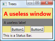
LogicalAndVisualTree1.xaml
Write the following code into the empty LogicalAndVisualTree1.xaml:
<Window
 xmlns="http://schemas.microsoft.com/winfx/2006/xaml/presentation"
 xmlns:x="http://schemas.microsoft.com/winfx/2006/xaml"
 x:Class="myWindow"
 Title="Trees" SizeToContent="WidthAndHeight"
 Background="Khaki">
 <StackPanel>
  <Label FontWeight="Bold" FontSize="20" Foreground="Red"
         Content="A useless window"/>
  <Label Content="A useless label" Background="Gray"/>
  <StackPanel Orientation="Horizontal" HorizontalAlignment="Center">
   <Button>Button1</Button>
   <Label Width="20"/><!--empty space-->
   <Button>Button2</Button>
  </StackPanel>
  <StatusBar>This is a Status Bar.</StatusBar>
 </StackPanel>
</Window> | |
 |
LogicalAndVisualTree1.cs
Write the following code into the empty LogicalAndVisualTree1.cs:
using System;
using System.Diagnostics;
using System.Windows;
using System.Windows.Media;

public partial class myWindow : Window
{ [STAThread] static void Main() { new Application().Run( new myWindow() ); }

  public myWindow()
  { InitializeComponent();
    Debug.WriteLine("Here begins the logical tree.");
    PrintLogicalTree(0, this);
    Debug.WriteLine("Here ends the logical tree.");
  }

  protected override void OnContentRendered( EventArgs e )
  { base.OnContentRendered( e );
    Debug.WriteLine("Here begins the visual tree.");
    PrintVisualTree(0, this);
    Debug.WriteLine("Here ends the visual tree.");
  }

  void PrintLogicalTree( int depth, object obj )
  { // Print the object with preceding spaces that represent its depth
    Debug.WriteLine(new string( ' ', depth ) + obj);
    // Sometimes leaf nodes aren't DependencyObjects (e.g. strings)
    if (!(obj is DependencyObject)) return;
    // Check if this element contains other elements
    foreach (object child in LogicalTreeHelper.GetChildren( obj as DependencyObject ))
    { // process each contained elemet recursivly
      PrintLogicalTree( depth + 1, child );
    }
  }

  void PrintVisualTree( int depth, DependencyObject obj )
  { // Print the object with preceding spaces that represent its depth
    Debug.WriteLine(new string( ' ', depth ) + obj );
    // Check if this element contains other elements
    for (int i = 0; i < VisualTreeHelper.GetChildrenCount( obj ); i++)
    { // process each contained elemet recursivly
      PrintVisualTree( depth + 1, VisualTreeHelper.GetChild( obj, i ) );
    }
  }
}
Although the logical tree can be traversed within the Window's constructor, the visual tree is empty until the Window undergoes layout at least once. That is why PrintVisualTree is called within OnContentRendered, which doesn't get called until after layout occurs.
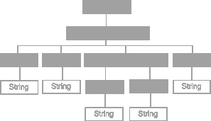
The logical and visual tree output
In the main menu of Visual Studio 2008 click View → Output. The Output window of LogicalAndVisualTree1 appears at the bottom and shows compiling infos together with the Debug.WriteLine( ... ) results:
Here begins the logical tree.
myWindow
 System.Windows.Controls.StackPanel
  System.Windows.Controls.Label: A useless window
   A useless window
  System.Windows.Controls.Label: A useless label
   A useless label
  System.Windows.Controls.StackPanel
   System.Windows.Controls.Button: Button1
    Button1
   System.Windows.Controls.Label
   System.Windows.Controls.Button: Button2
    Button2
  System.Windows.Controls.Primitives.StatusBar Items.Count:1
   This is a Status Bar.
Here ends the logical tree. |
Nested objects form a Logical Tree where property values can be propagated down to child elements and events can be propagated up and down. Mostly logical trees are coded in XAML but they can be written in C# or in any mixture of XAML and C# too.
|
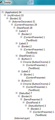
Here begins the visual tree.
myWindow
 System.Windows.Controls.Border
  System.Windows.Documents.AdornerDecorator
   System.Windows.Controls.ContentPresenter
    System.Windows.Controls.StackPanel
     System.Windows.Controls.Label: A useless window
      System.Windows.Controls.Border
       System.Windows.Controls.ContentPresenter
        System.Windows.Controls.TextBlock
     System.Windows.Controls.Label: A useless label
      System.Windows.Controls.Border
       System.Windows.Controls.ContentPresenter
        System.Windows.Controls.TextBlock
     System.Windows.Controls.StackPanel
      System.Windows.Controls.Button: Button1
       Microsoft.Windows.Themes.ButtonChrome
        System.Windows.Controls.ContentPresenter
         System.Windows.Controls.TextBlock
      System.Windows.Controls.Label
       System.Windows.Controls.Border
        System.Windows.Controls.ContentPresenter
      System.Windows.Controls.Button: Button2
       Microsoft.Windows.Themes.ButtonChrome
        System.Windows.Controls.ContentPresenter
         System.Windows.Controls.TextBlock
     System.Windows.Controls.Primitives.StatusBar Items.Count:1
      System.Windows.Controls.Border
       System.Windows.Controls.ItemsPresenter
        System.Windows.Controls.DockPanel
         System.Windows.Controls.Primitives.StatusBarItem: ...
          System.Windows.Controls.Border
           System.Windows.Controls.ContentPresenter
            System.Windows.Controls.TextBlock
   System.Windows.Documents.AdornerLayer
Here ends the visual tree. |
The Visual Tree is more complicated than its corresponding logical tree. It expands the logical tree to its inner components that derive from System.Windows.Media.Visual or System.Windows.Media.Visual3D. Other elements as simple string content are not included because they don't have inherent rendering behavior of their own. It reveals that Button and Label are comprised of the same elements, except Button uses an obscure ButtonChrome element rather than a Border. These controls have different default property values. For example, Button has a default Margin of 10 on all sides whereas Label has a default Margin of 0.

Explanations and Links:
An Adorner overlays visual decorations on a control.
The ContentPresenter renders the surface of the control.
Every ContentControl has a ControlPresenter within its ControlTemplate.
ButtonChrome creates a theme-specific look for all Button-elements written with the .NET Framework. A Theme is defined by Windows 7 and Vista and influences the collective appearance of all controls and other visual elements.
|
|
|
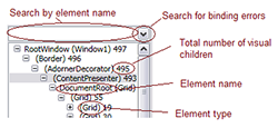
The Snoop Utility
 | |
Snoop is a wonderfull utility (incorporated into Expression Blend) but available separatly at http://blois.us/Snoop/ to inspect Visual Trees.
It inspects all running WPF applications and furnishes the tree view on the left for LogicalAndVisualTree1.
There is no need to download Snoop's source code. Just download and install the Installer Zip-file.
Explanations:
 |
Templates
In WPF a control as Button has no visual tree of its own, it is "lookless", it is invisible because it has no properties like Background, Foreground, BorderBrush, BorderThickness, FocusVisualStyle, HorizontalContentAlignment, VerticalContentAlignment, Padding, Template. It obtains all these properties by a complicated process:
A DefaultStyle-property refers to a ThemeStyle-object defined deep in Windows 7 and Vista System Scope resources, from where the operating system returns one of its so called Theme Templates: Aero, Classic, Luna or Royale.
See the excellent description of Ian Griffiths: How WPF controls get their default templates ?
We can override parts of this default template with a ControlTemplate defined once for all inside a <Window.Resources> header tag.
While this template accepts only one content we have to pack up the Ellipse and the TextBlock inside a Grid.
<Window
 xmlns="http://schemas.microsoft.com/winfx/2006/xaml/presentation"
 xmlns:x="http://schemas.microsoft.com/winfx/2006/xaml"
 x:Class="myWindow"
 Title="Template" Width="200" Height="150"
 Background="Khaki">
 <Window.Resources>
  <Style TargetType="{x:Type Button}">
   <Setter Property="Width"    Value="100"/>
   <Setter Property="Height"   Value= "30"/>
   <Setter Property="FontSize" Value= "10"/>
   <EventSetter Event="Click" Handler="onButtonClick"/>
  </Style>
  <ControlTemplate x:Key="template">
   <Grid>
    <Ellipse Stroke="Black" Fill="Orange"/>
    <TextBlock
      Text="{TemplateBinding Property=Button.Content}"
      HorizontalAlignment="Center"
      VerticalAlignment  ="Center"/>
   </Grid>
  </ControlTemplate>
 </Window.Resources>

 <StackPanel VerticalAlignment="Center">
  <Button Content="NormalButton"/>
  <Button Template="{StaticResource template}"
          Content="TemplateButton1"/>
  <Button Template="{StaticResource template}"
          Content="TemplateButton2"/>
 </StackPanel>
</Window> | |
using System;
using System.Windows;
using System.Windows.Controls;
public partial class myWindow : Window
{ [STAThread] static void Main()
  { new Application().Run( new myWindow() ); }
  public myWindow()
  { InitializeComponent(); }
  private void onButtonClick( Object sender, RoutedEventArgs rea )
  { Button button = (Button)sender;
    String s0 = (String)button.Content;
    String s1 = null;
    for ( int i = s0.Length-1; i >= 0; i-- ) s1 += s0[i];
    button.Content = s1;
  }
}
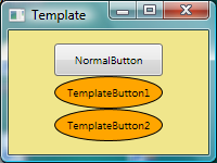
Both elliptical TemplateButtons look different and behave different on mouse entering
and on mouse click (no background changes) but they have the same Logical- and Visual-Tree as NormalButton.
|
| top of page:
|