Controls, Panels and other FrameworkElements
Such elements of the user interface which are somehow visible on the GUI of a web page or a desktop are usually called Widgets. WPF derives its Widgets via a hierarchy of classes adding functionality on any inheritance step.
FrameworkElement extends UIElement and provides support for many scenarios of the user interface. Most classes dealing with the user interface derive from FrameworkElement either directly or through the intermediate base classes Control or Panel.
The Control class is the most important base class for many elements of the user interface.
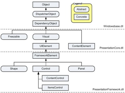
See: Control_Classes.pdf which has been cut out from the WPF class hierarchy handbill from T.C. Huber's book: www.galileocomputing.de.
Class Hierarchy above the Control Class
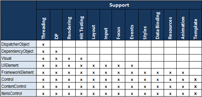 | |
Object: The base class for all .NET classes.
DispatcherObject: The base class for any object that wishes to be accessed only on the thread that created it. A Dispatcher maintains a prioritized queue of work items for a specific thread. Most WPF classes derive from DispatcherObject, and are therefore inherently thread-unsafe.
DependencyObject: The base class for any object that can support dependency properties. It defines the GetValue and SetValue methods of dependency properties.
Freezable: The base class for objects that can be "frozen" into a read-only state for performance reasons. Freezables, once frozen, can even be safely shared among multiple threads, unlike all other DispatcherObjects. Frozen objects can never be unfrozen, but cloned to unfrozen copies.
Visual: The base class for all objects that have their own visual representation. Its primary role is to provide rendering support.
UIElement: The base class for all visual objects with support for routed events, command binding, layout, and focus.
ContentElement: A base class similar to UIElement, but for pieces of content that don't have rendering behavior on their own. Instead, ContentElements are hosted in a Visual-derived class to be rendered on the screen.
FrameworkElement: The base class that adds support for styles, data binding, resources, and a few common mechanisms for Windows-based controls such as tooltips and context menus.
Shape: The base class for shape elements, such as Ellipse, Polygon and Rectangle.
Panel: The base class for elements with fixed positions in a WPF application.
Control: The base class for familiar controls such as Button and ListBox adds many properties to its FrameworkElement base class, such as Foreground, Background, and FontSize and the Template property which defines the complete appearance.
ContentControl: The base class for controls that can have only one child element. This child element can be anything from a string to a layout panel with a combination of other controls and shapes.
ItemsControl: The base class for controls that can be used to present a collection of items, such as the ListBox and TreeView controls.
See: Guided tour of the WPF class hierarchy |
  |
ContentControls
The most important (and most simple) subclass of class Control is ContentControl. It holds and displays just one single element = one piece of content (which can be deeply nested). This one-child limit is what differentiates ContentControls from ItemsControls and other FrameworkElements such as Panel, Page, TextBlock etc.
All Controls having more than one child are no ContentControls.
Descents of the ContentControl class:
→Window                →NavigationWindow
→Primitives            →StatusBarItem
                       →ButtonBase      →GridViewColumnHeader
                                        →Button
                                        →RepeatButton
                                        →ToggleButton        →RadioButton
                                                             →CheckBox
→HeaderedContentControl→GroupBox
                       →Expander
                       →TabItem
→Label
→Frame
→ScrollViewer
→ToolTip
→UserControl
→ListBoxItem

Table of important ContentControls:
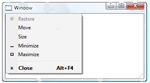
| Window | The point of interaction between a user and a standalone application. A window has two distinct areas:
1. A non-client area, which hosts the windows adornments, including an icon, title, System menu, minimize button, maximize button, restore button, close button, and a border.
2. A client area, which hosts application-specific content. |
 |
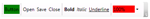
| Button | Is one of the most basic element of a user interface. A Button inherently reacts to a Click-event. |  |
| RepeatButton |
Same as Button but raises the Click-event repeatedly from the time it is pressed until it is released. The Delay property determines when the event begins. The velocity of the repetitions is controlled with the Interval property. → Sample |  |
| RadioButton |
Is usually used as an item in a group of RadioButton controls rather than a single RadioButton. When a RadioButton is selected, it cannot be cleared by clicking it. When RadioButton elements are grouped, the buttons are mutually exclusive. A user can select only one item at a time within a RadioButton group. Important difference to CheckBox: When a RadioButton is selected all other RadioButtons will be automatically deselected. | 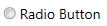 |
| CheckBox |
A binary button that can be checked and unchecked independently of other CheckBoxes in a group. |
 |
| Label |
Mostly used to show short text. Provides support for quick keyboard access = mnemonics. |
|
| GroupBox |
The GroupBox is the simplest of the HeaderedContentControls: a box with rounded corners and a title. It is often used to group small sets of related controls such as Buttons or CheckBoxes under a common title. → Sample |  |
| Expander |
The Expander is a HeaderedContentControl which wraps a region of content as TabControl does but shows or hides the content by clicking a small arrow button. Expanders are used in online help and on web pages. → Sample |  |
| Frame |
Provides the ability to navigate to content as Page does. A Source property allows to set the URI for the desired content and Frame returns an object that contains the content. → Sample | |
See also: Video: Why Controls Have a Content Property.
ItemsControls
An ItemsControl is a type of Control that contains a collection of multiple items, such as strings, objects, or other elements. Adding a child to an ItemsControl object adds it to an ItemCollection.
List of ItemsControls:
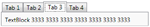
1. Selector with its children ListBox, ComboBox and TabControl,
2. MenuBase with its children Menu and ContextMenu,
3. HeaderedItemsControl with its child ToolBar,
4. StatusBar and 5. TreeView.
Table of important ItemsControls:
| |
Panels
A Panel is a type of FrameworkElement that positions and arranges one or more child objects.
List of panel controls: StackPanel, DockPanel, UniformGrid, Grid, Canvas, TabPanel, ToolBarOverflowPanel, ToolBarPanel, VirtualizingPanel, VirtualizingStackPanel, WrapPanel
Important Panel Controls are:
| StackPanel | Allows to stack elements both vertically, which is the default setting, or horizontally. | 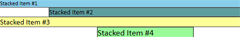 |
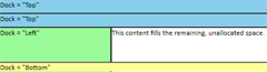
| DockPanel |
Arranges child elements on top, left, right and bottom within the client area = Dock property. A set of child elements with the same Dock property values are positioned differently depending on the order. The last child element fills the remaining space if LastChildFill is true. |
 |
| UniformGrid |
Arranges content in a matrix of columns and rows where all the cells have the same size. |
|
| Grid |
Same as UniformGrid but by default, rows and columns take up the least amount of space necessary to accommodate the largest content within any cell contained in a given row or column. |
 |
| Canvas | Child elements are positioned by coordiantes. Child elements of a Canvas are never resized, they are just positioned at their designated coordinates. Canvas is the only panel element that has no inherent layout. It has default Height and Width properties of zero. |  |
Text Containers
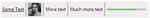
| TextBlock |
Lightweight control for displaying small amounts of flow content. |
 |
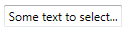
| TextBox |
Display and edit unformatted text. |
 |
| RichTextBox | A TextBox which operates on FlowDocument objects. | |
| FlowDocumentReader |
Provides a control for viewing flow content, with built-in support for multiple viewing modes. Other name: SinglePageViewer. |  |
Miscellaneous Containers
| Page |
Content that can be navigated to and hosted by a browser. An application typically has two or more pages, which can be navigated between using a Hyperlink or NavigationService or a browser. See: Navigation Overview. |
|
| Slider |
Enables the user to select from a range of values by moving a Thumb control along a track.
. |  |
| ViewBox |
A child is automatically stretched and scaled to fill the available client area. |
 |
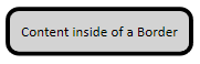
| Border |
Draws a border and a background around another element. |
 |
| top of page: |