Install 1) Visual Web Developer 2010 Express Edition English
and 2) Silverlight 4 Tools for Visual Studio 2010.
Preliminaries
Guidance for Visual Web Developer 2010 Express:
| 1 |
Main Menu after start of VWD Express: File → New Project... → Project types: Visual C# (double click) → Silverlight → Templates: Silverlight Application
Name: ControlsGallery1 → Location: C:\temp\SLProjects → Create directory for solution: switch off → OK.
An Add Silverlight Application-Window appears.
Choose "Automatically generate a test page to host Silverlight at build time" → OK. |
| 2 |
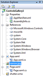
In the Solution Explorer window right click branch References → Add Reference... → Tab Browse → Now you have to look where Silverlight Toolkit installed Microsoft.Windows.Controls.dll and select it. → Quit with OK and check whether Microsoft.Windows.Controls arrived as sub-branch of References. |
| 3 | Download the sound file shutter.wma and store it into the project directory C:\Temp\SLProjects\ControlsGallery1. |
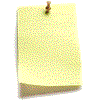
| 4 | Download the image file narrow.jpg and store it into the project directory C:\Temp\SLProjects\ControlsGallery1. |
| 5 |
In the Solution Explorer window right click the main branch ControlsGallery1 → Add → Existing Item... → Select both shutter.wma and narrow.jpg → Add and check if they arrived in the main branch ControlsGallery1. |
| 6 |
In both Properties-windows of shutter.wma and narrow.jpg set the Build Action to Resource. |
|  |
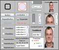
In the Solution Explorer - ControlsGallery1 click the branch Page.xaml. A split window will appear where the lower part contains the default xaml code. Delete this code completely and replace it by the code of Page.xaml which follows.
Page.xaml
<UserControl x:Class="ControlsGallery1.Page"
  xmlns:controls="clr-namespace:Microsoft.Windows.Controls;assembly=Microsoft.Windows.Controls"
  xmlns="http://schemas.microsoft.com/winfx/2006/xaml/presentation"
  xmlns:x="http://schemas.microsoft.com/winfx/2006/xaml"
  Width="400" Height="340" >
  <Border BorderBrush="Black" BorderThickness="2">
    <Grid ShowGridLines ="True" Background="Silver">
      <Grid.ColumnDefinitions>
        <ColumnDefinition/>
        <ColumnDefinition/>
        <ColumnDefinition/>
        <ColumnDefinition/>
      </Grid.ColumnDefinitions>
      <Grid.RowDefinitions>
        <RowDefinition/>
        <RowDefinition/>
        <RowDefinition/>
        <RowDefinition/>
      </Grid.RowDefinitions>
      <!--************************************************************************-->
      <!-- First column **********************************************************-->
      <!--************************************************************************-->
      <!-- column 0, row 0 *******************************************************-->
      <Border Grid.Column="0" Grid.Row="0" Width="40" Height="40"
              BorderBrush="Black" BorderThickness="5" CornerRadius="6"
              ToolTipService.ToolTip="    I'm a Border around nothing."/>
      <!-- column 0, row 1 *******************************************************-->
      <Button Grid.Column="0" Grid.Row="1" Height="20" Margin="5"
              Content="Button" VerticalAlignment="Top" Click="Button_Click"
              ToolTipService.ToolTip="    I'm a useless Button."/>
      <RepeatButton Grid.Column="0" Grid.Row="1" Height="20" Margin="5"
              Content="RepeatButton" VerticalAlignment="Center"
              Interval="100" Click="Button_Click"
              ToolTipService.ToolTip="    I raise 10 Click events per second."/>
      <HyperlinkButton Grid.Column="0" Grid.Row="1" Margin="5" Click="Button_Click"
              Content="Hyperlink" HorizontalAlignment="Center" VerticalAlignment="Bottom"
              ToolTipService.ToolTip="    I'm an unlinked HyperlinkButton."/>
      <!-- column 0, row 2 *******************************************************-->
      <CheckBox Grid.Column="0" Grid.Row="2" Content="CheckBox"
                HorizontalAlignment="Center" Margin="0,15,0,0"/>
      <CheckBox Grid.Column="0" Grid.Row="2" Content="CheckBox"
                HorizontalAlignment="Center" VerticalAlignment="Bottom" Margin="0,0,0,15"/>
      <!-- column 0, row 3 *******************************************************-->
      <RadioButton Grid.Column="0" Grid.Row="3" Content="RadioButton"
                   HorizontalAlignment="Center" Margin="5"/>
      <RadioButton Grid.Column="0" Grid.Row="3" Content="RadioButton"
                   HorizontalAlignment="Center" VerticalAlignment="Center"/>
      <RadioButton Grid.Column="0" Grid.Row="3" Content="RadioButton"
                   HorizontalAlignment="Center" VerticalAlignment="Bottom" Margin="5"/>
      <!--************************************************************************-->
      <!-- Second column *********************************************************-->
      <!--************************************************************************-->
      <!-- column 1, row 0 *******************************************************-->
      <Rectangle Grid.Column="1" Grid.Row="0" Stroke="Black" Fill="Cornsilk"
                 Width="60" Height="60"
                 ToolTipService.ToolTip="    I'm a Rectangle."/>
      <Ellipse   Grid.Column="1" Grid.Row="0" Stroke="Red" Fill="Lavender"
                 Width="50" Height="50"
                 ToolTipService.ToolTip="    I'm an Ellipse inside a Rectangle."/>
      <!-- column 1, row 1 *******************************************************-->
      <!-- The ComboBox header shows the selected ComboBoxItem -->
      <ComboBox Grid.Column="1" Grid.Row="1" Height="20" Margin="5"
                VerticalAlignment="Top"
                ToolTipService.ToolTip="    I'm a ComboBox with 3 ComboBoxItems.">
                <ComboBoxItem Content="Item1"    Height="16" FontSize="9"/>
                <ComboBoxItem Content="Item2"    Height="16" FontSize="9"/>
                <ComboBoxItem Content="ComboBox" Height="16" FontSize="9" IsSelected="True"/>
      </ComboBox>
      <!-- Expander is part of the Silverlight Toolkit namespace:Microsoft.Windows.Controls -->
      <controls:Expander x:Name="Expander1" Grid.Column="1" Grid.Row="1" Margin="0,5,0,0"
                 HorizontalAlignment="Center" VerticalAlignment="Center" ExpandDirection="Down"
                 Header="Expander">
                 <TextBox TextWrapping="Wrap"  FontSize="8" Text="I'm so expanded. Please collapse me!"/>
      </controls:Expander>
      <!-- Popup depends on 2 events of an associated control TextBlock -->
      <Popup x:Name="Popup" HorizontalOffset="410" VerticalOffset="90">
        <TextBlock Width="100" TextWrapping="Wrap" Foreground="Red"
                   Text="This is a Popup with simple text.
                         A Popup can also contain complex content such as images."/>
      </Popup>
      <TextBlock Grid.Column="1" Grid.Row="1" Text="Pop me up !" Foreground="Tomato" Margin="5"
                 HorizontalAlignment="Center" VerticalAlignment="Bottom"
                 MouseEnter="Open_Popup" MouseLeave="Close_Popup"/>
      <!-- column 1, row 2 *******************************************************-->
      <!-- http://www.microsoft.com/germany/msdn/solve/knowhow/howto/webentwicklung/WieVerwendeIchDasListBoxControlInSilverlight.mspx -->
      <ListBox  Grid.Column="1" Grid.Row="2" Margin="3,5,3,5"
                ToolTipService.ToolTip="    I'm a ListBox with 5 selectable ListBoxItems.">
                <ListBoxItem   Content="ListBoxItem 1" Height="16" FontSize="9"/>
                <ListBoxItem   Content="ListBoxItem 2" Height="16" FontSize="9"/>
                <ListBoxItem   Content="ListBoxItem 3" Height="16" FontSize="9"/>
                <ListBoxItem   Content="ListBoxItem 4" Height="16" FontSize="9"/>
                <ListBoxItem   Content="ListBoxItem 5" Height="16" FontSize="9"/>
      </ListBox>
      <!-- column 1, row 3 *******************************************************-->
      <!-- AutoCompleteBox is part of the Silverlight Toolkit namespace:Microsoft.Windows.Controls -->
      <!-- It must be initialized by code behind with an array of strings -->
      <StackPanel Grid.Column="1" Grid.Row="3">
        <TextBlock Text="AutoCompleteBox"      FontSize="10" HorizontalAlignment="Center"/>
        <TextBlock Text="Type in:"             FontSize="10" HorizontalAlignment="Center"/>
        <TextBlock Text="'a', 'A', 'b' or 'B'" FontSize="10" HorizontalAlignment="Center"/>
        <controls:AutoCompleteBox x:Name="AutoCompleteBox" Margin="5,0,5,0" Text="Type here!"/>
      </StackPanel>
      <!--************************************************************************-->
      <!-- Third column **********************************************************-->
      <!--************************************************************************-->
      <!-- column 2, row 0 *******************************************************-->
      <Slider    Grid.Column="2" Grid.Row="0" Background="Gray" Width="70" Margin="5"
                 HorizontalAlignment="Center" VerticalAlignment="Top"
                 ToolTipService.ToolTip="    I'm a Slider."/>
      <ScrollBar Grid.Column="2" Grid.Row="0" Width="70" Margin="10"
                 Orientation="Horizontal"
                 HorizontalAlignment="Center" VerticalAlignment="Center"
                 ToolTipService.ToolTip="    I'm a ScrollBar."/>
      <!-- ProgressBar entertains the user during a time consuming process-->
      <ProgressBar Grid.Column="2" Grid.Row="0" Width="70" Height="10" Margin="10"
                 HorizontalAlignment="Center" VerticalAlignment="Bottom"
                 Value="50" BorderBrush="Black" Foreground="Green"
                 ToolTipService.ToolTip="    I'm a ProgressBar."/>
      <!-- column 2, row 1 *******************************************************-->
      <!-- same as above but vertical. ProgressBar can't be drawn vertically -->
      <Slider    Grid.Column="2" Grid.Row="1" Background="Gray" Height="70" Margin="20,0,0,0"
                 Orientation="Vertical"
                 HorizontalAlignment="Left" VerticalAlignment="Center"
                 ToolTipService.ToolTip="    I'm a Slider."/>
      <ScrollBar Grid.Column="2" Grid.Row="1" Height="70" Margin="0,0,20,0"
                 Orientation="Vertical"
                 HorizontalAlignment="Right" VerticalAlignment="Center"
                 ToolTipService.ToolTip="    I'm a ScrollBar."/>
      <!-- column 2, row 2 *******************************************************-->
      <!-- ContentControl offers the simpliest way to draw unformatted text. -->
      <ContentControl Grid.Column="2" Grid.Row="2" Margin="0,5,0,0"
                 Content="ContentControl" FontStyle="Italic"
                 HorizontalAlignment="Center" VerticalAlignment="Top"
                 ToolTipService.ToolTip="I'm a simple ContentControl."/>
      <!-- TextBlock draws formatted text. -->
      <TextBlock Grid.Column="2" Grid.Row="2" Margin="0,0,0,10"
                 Text="TextBlock" FontWeight="Bold"
                 HorizontalAlignment="Center" VerticalAlignment="Center"
                 ToolTipService.ToolTip=" TextBlock for unformatted text."/>
      <!-- TextBox can receive text from the keyboard. -->
      <TextBox   Grid.Column="2" Grid.Row="2" Margin="5" Text="Edit Me !"
                 HorizontalAlignment="Center" VerticalAlignment="Bottom"
                 ToolTipService.ToolTip="I'm an editable TextBox."/>
      <!-- column 2, row 3 *******************************************************-->
      <!-- TreeView is part of the Silverlight Toolkit namespace:Microsoft.Windows.Controls -->
      <!-- I wrapped it by an InkPresenter (see column 3, row 2) to prevent clipping -->
      <InkPresenter Grid.Column="2" Grid.Row="3">
        <controls:TreeView Grid.Column="2" Grid.Row="2" FontSize="9">
          <controls:TreeViewItem     Header="Level 0" IsExpanded="True" Foreground="Red">
            <controls:TreeViewItem   Header="Level 1" IsExpanded="True" Foreground="Green">
              <controls:TreeViewItem Header="Lev 2"   IsExpanded="True" Foreground="Blue">
              </controls:TreeViewItem>
            </controls:TreeViewItem>
          </controls:TreeViewItem>
        </controls:TreeView>
        <TextBlock Text="      TreeView"/>
      </InkPresenter>
      <!--************************************************************************-->
      <!-- Fourth column *********************************************************-->
      <!--************************************************************************-->
      <!-- column 3, row 0 *******************************************************-->
      <!-- Grid overlays multiple contents by calling ContentPresenter for each of them -->
      <Grid Grid.Column="3" Grid.Row="0" Margin="5">
        <Image Source="narrow.jpg"/>
        <TextBlock Text="ContentPresenter" FontSize="10"/>
      </Grid>
      <!-- column 3, row 1 *******************************************************-->
      <ScrollViewer Grid.Column="3" Grid.Row="1" Margin="5,0,5,0"
                    ToolTipService.ToolTip="I'm a ScrollViewer.">
        <Image Source="narrow.jpg"/>
      </ScrollViewer>

      <!-- column 3, row 2 *******************************************************-->
      <!-- InkPresenter draws its multiple content 1:1 without any alignment nor clipping -->
      <InkPresenter Grid.Column="3" Grid.Row="2" Margin="5">
        <Image Source="narrow.jpg"/>
        <TextBlock Text="InkPresenter"/>
      </InkPresenter>
      <!-- end of main grid ******************************************************-->
    </Grid>
  </Border>
</UserControl>
  |
Page.xaml.cs
using System;
using System.Windows;
using System.Windows.Controls;
using System.Windows.Media;
using System.Windows.Resources;

namespace ControlsGallery1
{ public partial class Page : UserControl
  { MediaElement ME = new MediaElement();

    public Page()
    { InitializeComponent();
      //Load sound resource file for future use by
      //Button, RepeatButton and Hyperlink of column 0, row 1
      Uri U = new Uri( "ControlsGallery1;component/shutter.wma", UriKind.Relative );
      StreamResourceInfo sr = Application.GetResourceStream( U );
      ME.SetSource( sr.Stream );
      ME.AutoPlay = false;
      ME.Volume = 1;
      //Load word array for future use by the AutoCompleteBox of column 2, row 3
      AutoCompleteBox.ItemsSource = new string[]
        { "Adam", "Albert", "Adolph", "Betty", "Berta", "Bernhard", "Billy" };
    }

    //2 events of TextBlock "Pop me up !" of column 1, row 1
    private void Open_Popup ( object sender, RoutedEventArgs e )
    { Popup.IsOpen=true; }
    private void Close_Popup( object sender, RoutedEventArgs e )
    { Popup.IsOpen=false; }

    //common event of Button, RepeatButton and Hyperlink of column 0, row 1
    private void Button_Click( object sender, RoutedEventArgs e )
    { if ( ME.CurrentState == MediaElementState.Playing ) return;
      ME.Stop();
      ME.Play();
    }
  }
}
Main menu of Visual Web Developer 2010 Express → Debug → Start Debugging F5 or → Debug → Start Without Debugging Ctrl+F5.
Links
German video tutorials by Philipp Bauknecht:
Slider,
ScrollViewer,
StackBanel,
RadioButton,
ListBox,
Grid,
TextBlock
Test
| top of page: |
